Devlog #8 - Delving Into Level Design
Hello-Hello people,
Guys5 is welcoming everyone back to another exclusive look into the development of our upcoming Hack´n´Slash. So, what have we been up to?
The simple answer? We have been working on implementing our recent feedback, as well as working on new levels, and adding some further touches onto the current one. But let’s focus on the level design for now.
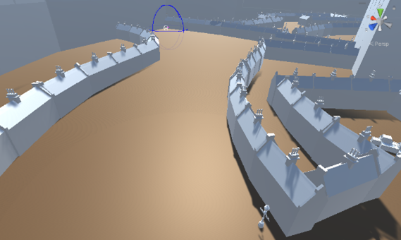
In the early stages of Level design, we rather quickly settled on the notion of having our map/city be a system of rings with walls & gates between them. But in order to usher life into the city, we needed to add roads, houses, alleys, open areas, décor, you name it. But for the longest time we ended up being stuck with a rather jaggedly design, with a lot of sharp corners and harsh edges, which can be seen in the early pictures and sketches of our map.
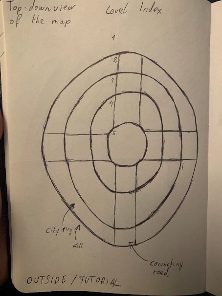
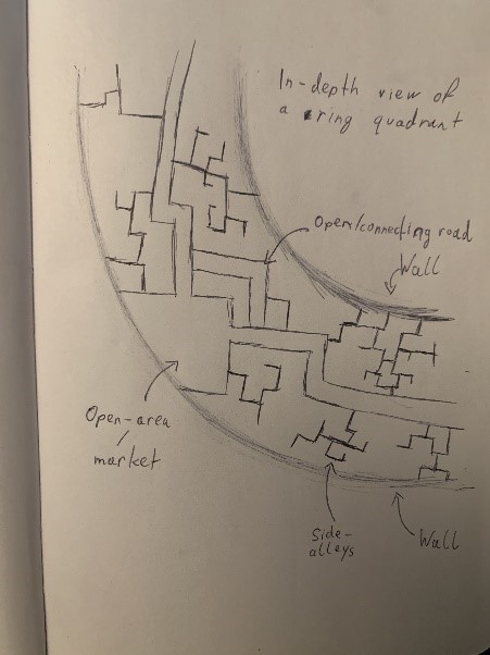
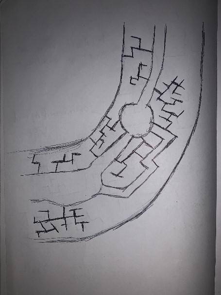
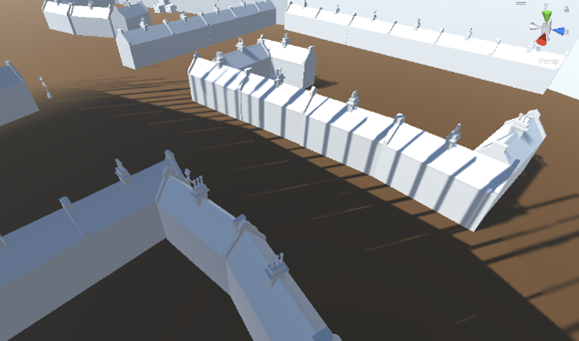
However, when we actually started to implement and work on the levels, we quickly realised that there was no major reason to force ourselves into the ideas we had previously had, and experimented with wider streets, less alleys, and more open areas. This change felt good, not only visually when we first viewed the level, but furthermore when we added enemies into the map.
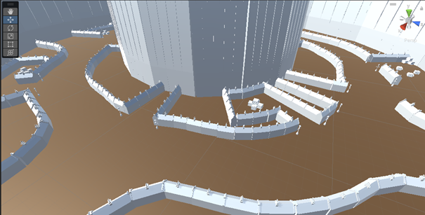
However, in our recent prototype/playtesting session, we figured out that the streets we had created were actually too wide, and needed to be adjusted, which is why we turned areas like these:
Into this
Now, enough of the past. “The future is now, old man. Tell us what will be added moving forward!” Well, the next steps will be drafting up and carefully planning out the other 2 city rings, as well as the creation of a final boss room, as well as a tutorial level set outside of the city itself!
But I wont spoil too much, you still need to play the game to garner the full experience ;)
Stay frosty,
Guys5
Crystal Edge: Retribution
| Status | In development |
| Author | Guys^5 Productions |
| Genre | Action, Adventure, Fighting |
| Tags | 3D, Action-Adventure, Fantasy, Hack and Slash, Indie, Singleplayer, Unity |
More posts
- Devlog #10 - Skill TreesNov 27, 2022
- Devlog #9 - Juice, More JuiceNov 27, 2022
- Devlog #7 - Prototype FeedbackNov 23, 2022
- Devlog #6 - Bug Fixes and Health BarsNov 20, 2022
- Devlog #5 - Game MechanicsNov 17, 2022
- Devlog #4 – Game Theme, Assets & Main Character DesignNov 06, 2022
- Devlog #3 – How Our Game Idea Came to beOct 27, 2022
- Devlog #2 - A Quick Update, Grapple Hooks and Moderate FrustrationsOct 23, 2022
- Devlog #1 - It's Hack 'n' Slashing TimeOct 15, 2022
Leave a comment
Log in with itch.io to leave a comment.